Brief Analysis: Engaging in a detailed communication process with the client to clarify their vision and specific needs. This step ensures a thorough understanding of the project’s goals and requirements, fostering a clear and effective creative direction.
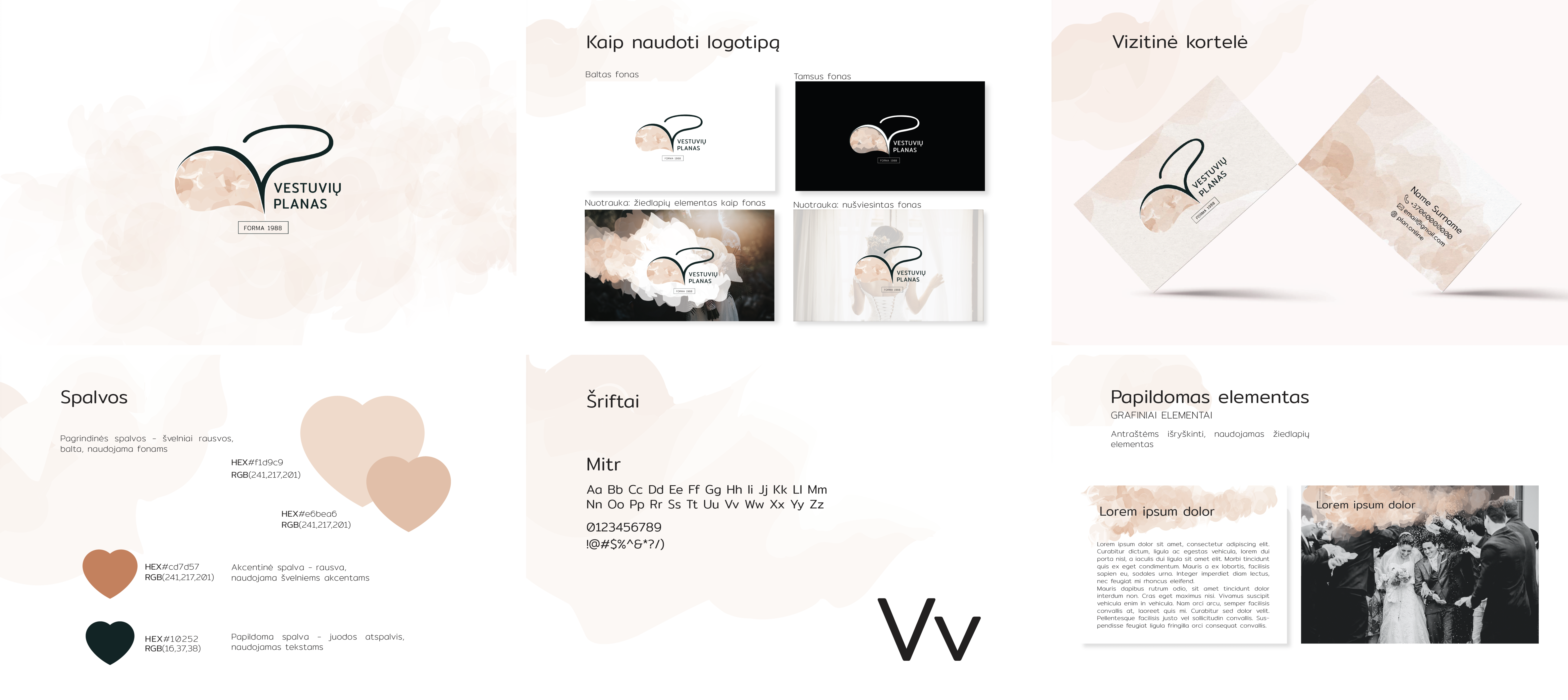
Visual Reasearch: firstly, the research was conducted by looking through competitors branding. The main goal at this stage was to understand what the client likes and dislikes about the competitors or other brands. To achieve this, the client was shown several different competitors and brands designs. The final decision was made that the product branding should feature harmonious light pastel colors, smooth lines, and create a feeling of celebration.
Branding
Logo, Business card, Branding guides
Logo Idea:The main idea of the logo is that the ‘V’ letter for ‘Vestuvės’ (Wedding) is the central element, witch contains smooth lines and symbolizing location and resembling wedding dance. The pastel and textured background contains many small details, collectively conveying the message that every detail matters for the celebration and in life.
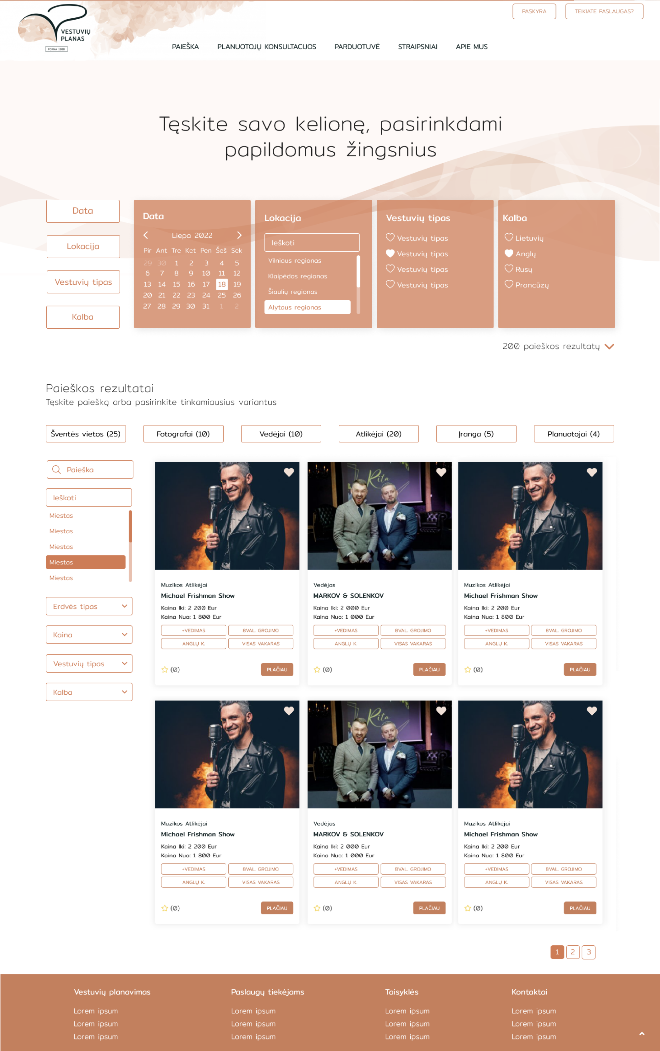
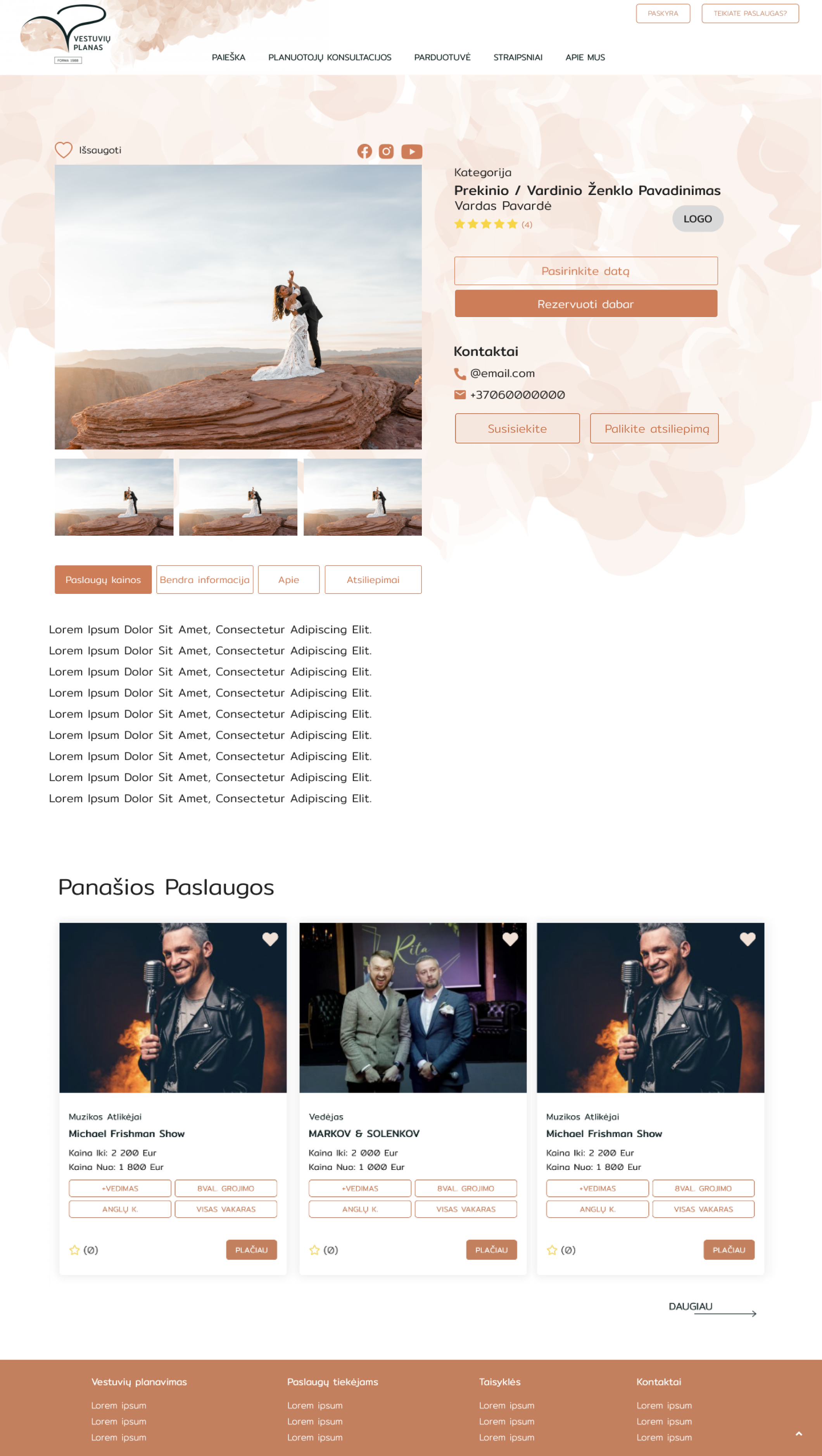
The main idea was to create an eye-catching, easy-to-use website that conveys a feeling of celebration. The primary task was to implement a reservation system where clients can find the best options that meet their needs without excessive scrolling.